Tuesday, 27 November 2012

Finalised print


Taking into consideration the photoshoots and experiments I have created within this project and bringing each of the elements together,I decided to focus on one body issue, being my father’s as It was the most powerful one to myself; taking something so negative and personal  which he has tried to put across in a positive way.

I used the Solar Plate printing process to create a portrait print of him stood upright on his own, displayed next to another Solar Plate print of the distorted scanned image, positioned in the centre, followed by a lino cut of his body issue. All presented A5 size on an A1 length long strip of paper.
I only used black ink for the prints I created as I did not want any colour to distract the viewer away from the concept.
This outcome is more of a proposal as I would really like to carry the project on for the next module. I feel it represents my research in well rounded way but also shows how I am going to develop the other photoshoots I have produced.
I would even like to use another media for the next module as I have only worked with print within the past ten weeks, which has been a challenge as I had never used it previously.

Displayed below is the finalised print.


Monday, 26 November 2012

Spontaneous Distortion

To develop my photoshoots and instead of using a Print Process which I have previously used, I wanted to create an illusion through another photographic method.

As I researched Hannah Hoch and Takahiro Kimura within this project who look at distortion within their work, I wanted to create some of my own experiments.

To do this I printed off the original photographs of the features the subject was not happy with, which I then placed on to the scanner and moved whilst scanning. Each of the images were moved in different directions, which has created a unique disortion within each experiment.
I feel they represent a disorientated illusion which the subject could even be feeling about themselves and their own body. The idea relates to the concept in an unusual way.

Personally I think these images are particularly strong and have chosen these three out of around ten experiments. The feature has been captured and distorted in a very poweful way.


Continuing with the previous photographs - focusing on the subjects body issue and their features in particular.
Not everyone was comfortable with this, this is why there arent as many.
The whole comment or key words have been written in eye liner on to the body.


FAP 201

Body Issues
 
 
For my ‘negotiated practice’ module I decided I wanted to focus on Body Issues within Identity and find out why people want to look the way they do. I became interested in how an individual might feel about themselves within their own body and if they are confident about certain aspects or would like to change/ cover anything up about themselves. I thought this could involve plastic surgery or just simply by choosing particular clothes or even wearing makeup.

When having discussions with others, it made me realise that I am very self conscious myself and so are many other people in today’s society. I wondered whether it had anything to do with the media and how they try to portray people to look ‘perfect’ highlighting their slightest imperfections.
This could affect us in the way we feel about our own bodies and I personally feel I would like us all to be confident no matter how we look.


I started by photographing a subject individually but shot four photoshoots within one. Concentrating on them stood in an upright position looking straight on at the camera – this was looking at how one might perceive them, not knowing what is wrong with them and what their body issue is. Another shoot inspired by Gillian Wearing (signs), the subject had to hold up a sign which I had previously written their body issue comment on to, these are displayed below.
I feel each of these photographs are very powerful presented on their own and display the concept of my project in a posotive way.


Monday, 10 September 2012

Metaphor - Tea for Two


For many years tea has been used in our every day lives and in more recent years it has become part of our socialising habit.
Throughout this body of work, I have become aware that women enjoy getting together over a cup of tea to have intimate converstions, exchanging thoughts and advice in a positive way.
I have experimented using a range of materials to create my own tea set, using plaster, wax, clay and varnish, with plaster and varnish being the most appropriate outcome displaying the conversations which have taken place over tea, clearly written inside the tea cup.
The two conversations which were chosen out of a dozen to display, were between an old friend and I when we met on two seperate occasions, discussing how she felt after she had given birth.
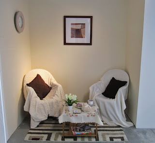
I realised the more comfortable the environment was, the more personal the conversation seemed to be, which is why I decided on presenting my idea within a living room Installation, portraying a domestic and feminist feel.
 
 
Two Chosen Teacups

Chosen Teapot
 
 Experimental Development

 
Final Installation Piece


Site
 
 
My ‘Site’ body of work was inspired by my trip to Berlin, Germany and different elements of the particular place. I was very inspired by the graffiti I witnessed when walking through the streets of Berlin, how the shapes looked familiar to graffiti I see at home but the language was completely different.  I knew I wanted to incorporate this within my piece in some way as it was such a common part of the life over there.

Tomas Saraceno’s ‘Cloud Cities’ exhibition inspired me also, by how the audience were interacting with his unusual environmental clouds suspended from the ceilings. I was fascinated how a piece of art worked so well with other people involving themselves within it.

I wanted the viewer to interact with my practice and decided to create a memory dome which people could contribute towards. The photographs and letters displayed inside are from my fellow students who attended the trip and their opinion of Berlin – what stood out to them the most. Alongside this I incorporated my own memories of the trip for the viewer to look at when inside the dome.

Because I did not want to emulate Saraceno’s transparent cities I used a black sheet and sprayed the graffiti I was inspired by over the top to cover the black polythene dome. This was large enough to cover the entrance when the viewer was inside.  As It was completely dark when stood up inside the 3metre dome, a torch needed to be used to select one individual memory of Berlin at a time.
I had a great response to this piece from fellow students who explain they enjoyed being apart of the piece and interacting with it in an unusual way.


Here are some other Photographs I took alongside the other subway Images at Night.

To create these images I moved the camera slightly on a landscape setting when the lens was trying to focus - a slight movement created a completely different effect. I felt this portrayed how someone might feel when walking through the long subway late at night.


Time

Third 4 week module based on Photography.


Mutability and Status was the focal point for my `Time’ Module. I wanted to photograph something static, but investigate how it changed through time. From this I decided to capture a subway in the afternoon and evening to portray my idea and see how it affected people’s emotions at different times of the day when walking through it.

I started by taking images of outside the subway but realised it would be more effective if I took step by step photographs walking through in the afternoon and late at night.  I experimented by displaying the snap shots above each other to create a joiner and chose the 10 most appropriate images. It was interesting to photograph at both times of the day as I felt completely comfortable in the afternoon by myself, but very uneasy when I went back at 10pm in the evening, my mood changed completely and felt as though I was somewhere different at both times. I felt this represented a clear idea of what I was trying to display of `Time’ in an effective way.
Poor Quality Image from Research Portfolio.
Space
 
Second 4 week module based on sculpture.
 
Within this body of work, I was inspired to focus on my childhood memories and progression through life as the object I decided to work from was my first pair of shoes. As I was inspired by Meret Oppenheim’s tea cup, transforming an every day object so it is no longer useful, I wanted to do something similar within my practice.
I took in to consideration as I have grown up I have left a trace behind and wanted to portray this within the piece. Due to this I wanted to include varied sizes within the final out come to reveal my steps through life including a range of sizes from my first pair to size 5.
The materials I used to create my seven pairs of shoes were; clay, scented wax from a slip cast mould, plaster, felt and newspaper, each of them looking completely different. Because I felt the idea of my childhood had a domestic feel and house hold materials were used to create the shoes, I wanted to create an installation and use objects which I see in my every day life and have remembered from my child hood creating a homely atmosphere.


Surface

First Four week moudle based on Drawing.

For this body of work, I decided to focus on the skin as a `surface’ as well as concentrating on my family life, looking at family member’s relationships as well their skin changing due to age.
The artists which inspired me throughout the project were Henry Moore and Ed Pien as I was interested in how their way of drawing is completely opposite. Moore is very traditional whereas Pien produces contemporary work and I felt I wanted to create a happy medium.  

I experimented with many materials within the project; baking paper, tracing paper, acetate, cling film, hand made paper and machine embroidery. However for my chosen four hands of my grand father and father, mother and father, grandmother and grandfather and my partner and I, I only wanted to concentrate on a few materials. I found the baking paper with dark pencil and oil displayed on a mirror worked very well to portray a frosted effect, as well acetate and marker, hand made paper and embroidery. I found each of the materials looked very fragile and represented fragility within the genders of the family.

Photographs which I was inspired by:

Poor Quality Images taken from Research Portfolio.